RUNNER

“Have fun running through different roads and characters”

Project background

AMA, a content management game website builder, helps people to build fully featured online games. Their research teams identified that people want to use their cellphone to access AMA gaming website. So, they asked us to design a mobile game to help people have fun and earn some extra cash.

Users

users include all people who like to play games and also specially those who like to earn cash.

Research findings

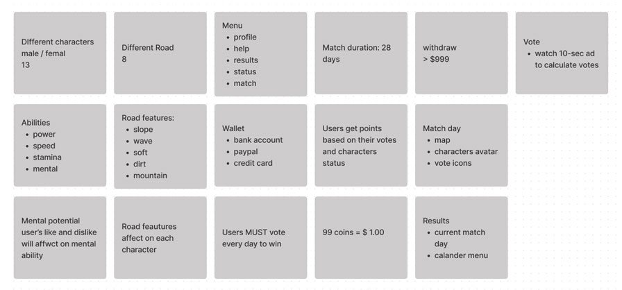
We collected all the feedbacks that we received from our research from users. We converted these feedbacks to user personas. One of them is Sam, a 19-year college student who loves gaming. He spends almost all of his free time doing gaming. The research revealed that Sam often wants to play games when he’s not home. So he needs a mobile game app.
The problem

Currently, AMA games are not compliant with mobile platforms and are difficult to use.

Ideate & Design

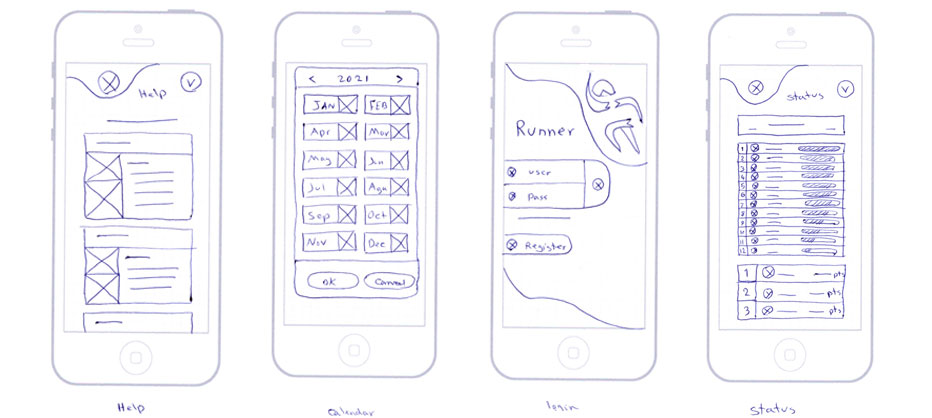
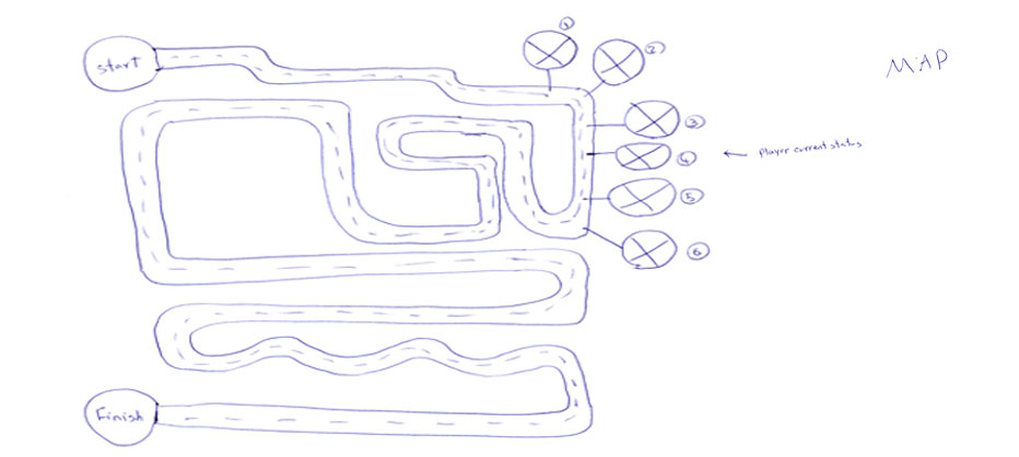
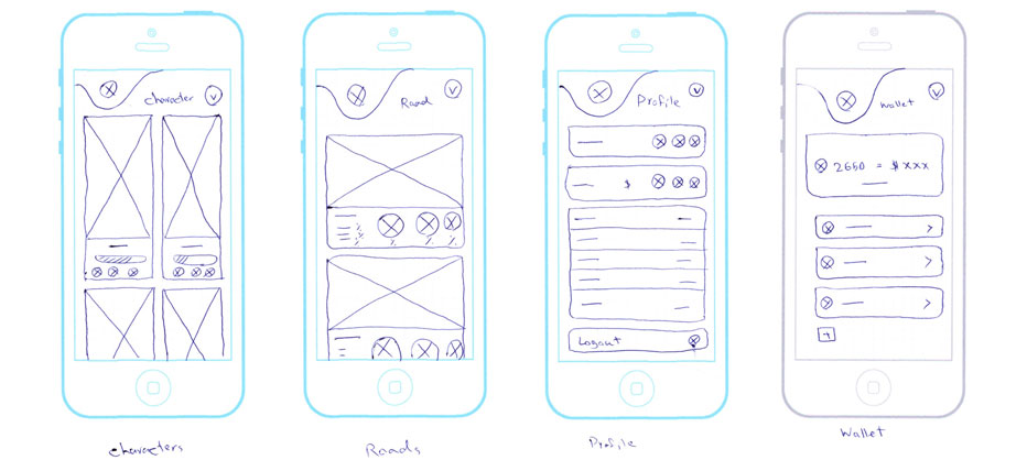
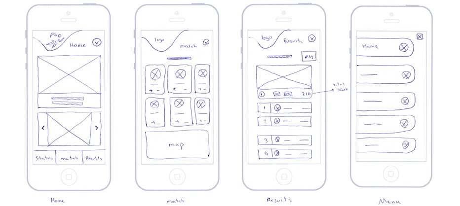
We brainstormed some solutions based on what we learned from our research. Then based on our empathize stage research we sketched out some concepts from our design.

Wireframes

In this step we know almost enough about our users and their needs so we created the first level of the design. The headings are clearly listed. Also, buttons, icons and images are there to show defined app sections.

Low-Fidelity Prototype

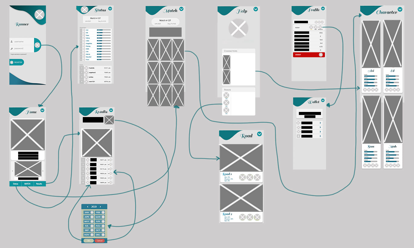
In this step, users are able to interact with each part of the design. We connected all the wireframes together.

Research Plan & Usability Study

We conducted a remote, unmoderated usability study between Jun 1-7. We tasked 14 participants. Our goal was to figure out what difficulties users encountered when using the app, such as match-day, results, calendar, vote and 10-seconds ad. Each session lasted for 10-15 minutes, including the test and interview questions. Participants were anyone love gaming. We included a balanced number of male and female who were aged 18 to 31 years old. We presented participants with some tasks that had them intact with the core task in the game.

Observations Participant A Participant B Participant C Participant D Participant E
Will use this game again
Won't use this game again
Easily could add credit card and bank account
Had a hard time to find out how banking options work
Feels frustrated connect to bank account
Speaks in a positive tone
Speak in a frustrated tone
Speaks in an annoyed tone
Speaks in a confident tone
Didn't understand connection between characters and roads
Confused about results
Usability study insights
Based on the data from the study, we identified three areas that needed to be addressed:

  Almost all users were confused about how to use the calendar to check other match date results, therefore they need more information and tips about the results.
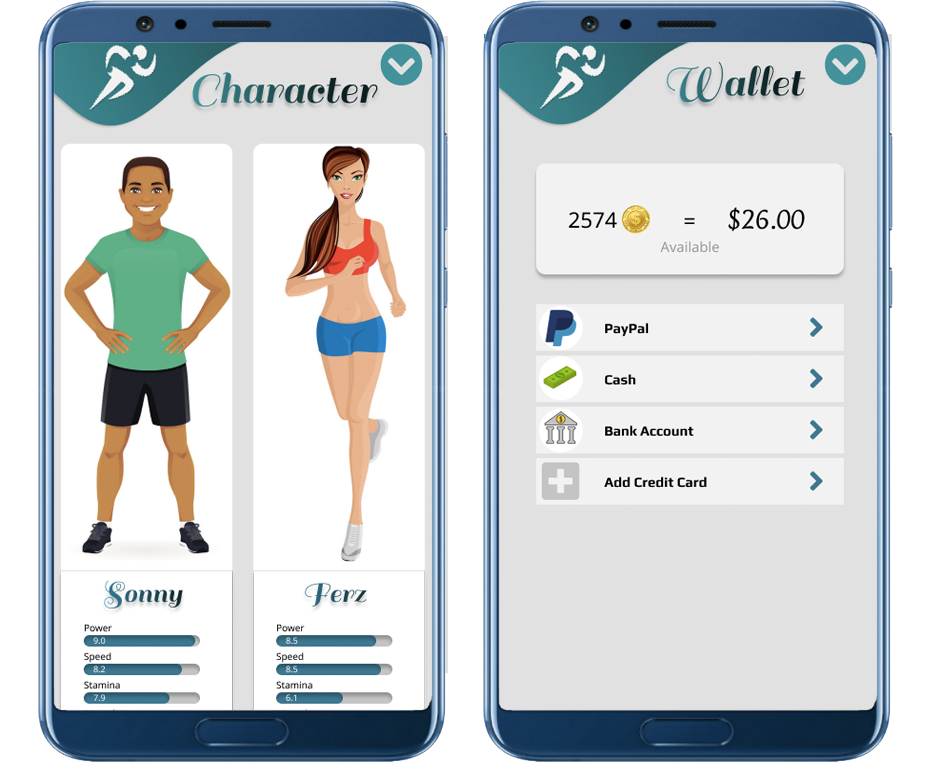
  Not everyone could find the wallet section quickly, so they need more context about bank and payment method features
  Some users didn’t understand the connection between each character and roads, therefore they need more information about each road and character features.
Mockup
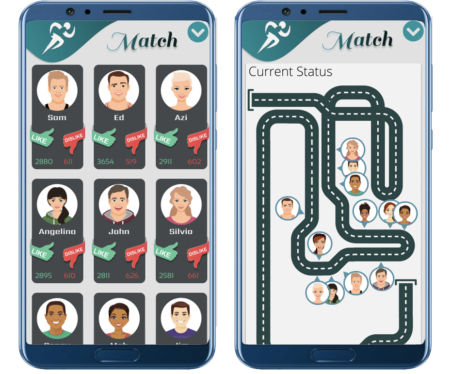
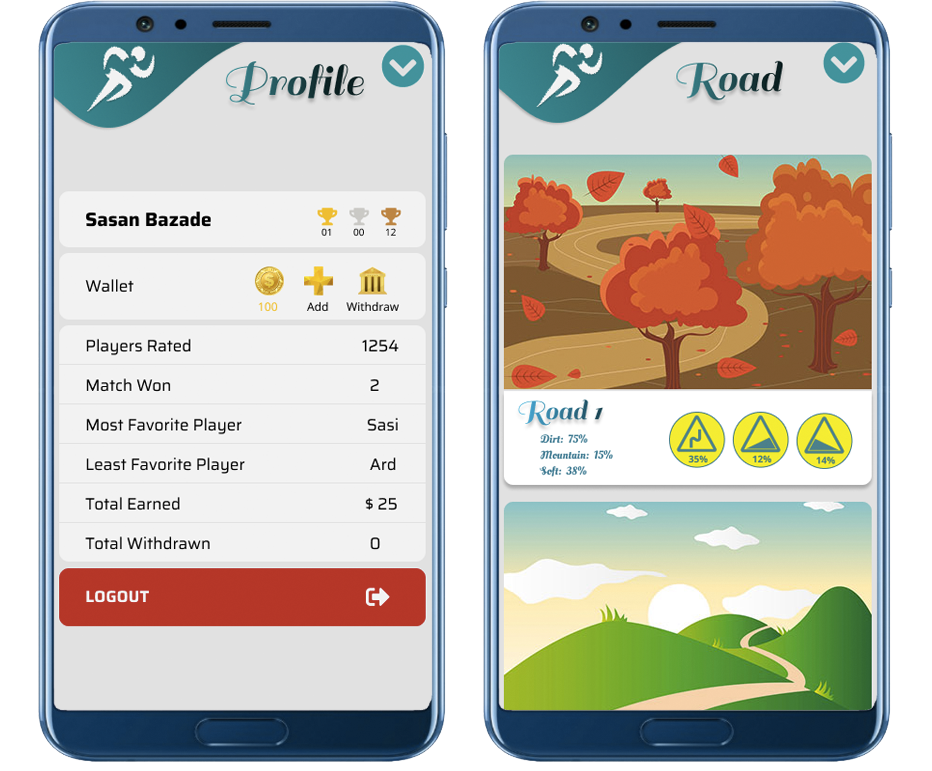
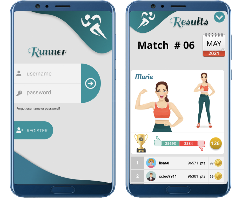
At this step, we started to add colors and images to our designs and converted it to high-fidelity versions. In order to improve the user experience we implemented the feedback we received. For example, we added more information on the character and roads page and also we added a help page for users.
High-Fidelity Prototype
At this stage we converted our design to a high-fidelity prototype. We connected all screens together into a working version that was representative of our final product. We changed each page based on the results from usability testing.This is what we passed off to the development team for production.
Accessibility considerations
in order to provide an inclusive and accessible experience for all we added screen readers throughout all screens.