PetShell
( App & Website )
"Finding Good Homes for PETS"
Project background
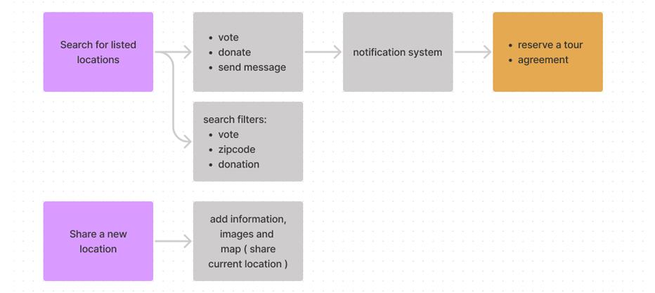
PetShel, a web based organization, tries to help communities to build a home for pets. Based on research, PetShel has identified that there are some good places close to each neighborhood for pets. They asked us to design an online tool to help people to find, share and make shelters near their communities. For example, this tool will suggest people to vote and donate for any loving shelters.

Users
PetShel’s primary users include all people who care about they communities and animals. They are all individual who wants to give a loving home to pets and create a safe place for them.

Research findings
We conducted user research and received feedback from users that we turned into user personas. One of our user personas, Ed, is a single 29 years old full time teacher who has 3 dogs and 1 cat. He loves his pets and cares about them, but he’s so busy and works faraway from his home. The research revealed that Ed sometimes cannot take care of his pets in a proper way. He likes to find a good and safe place near his home for them. Also, he wants to go and see them often after work.

The problem
Currently, the PetShel app has a complicated feature that often feels confusing and difficult to use.

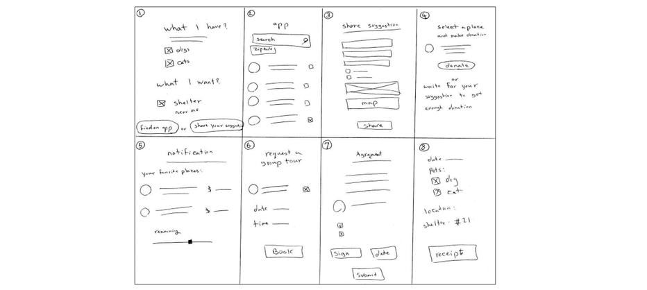
Ideate & Design
We sketched out some concepts from our app’s design based on what we learned about our users in the empathize stage using the Crazy 8’s approach. We rapidly brainstormed multiple creative solutions based on what we learned from our research to identify various ways we could begin designing.

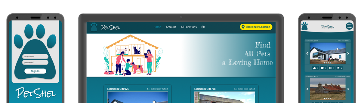
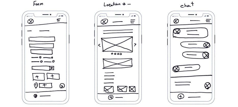
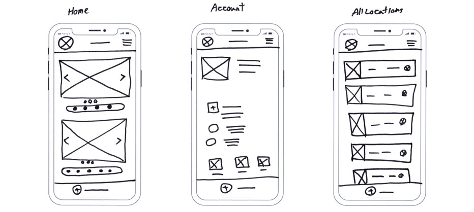
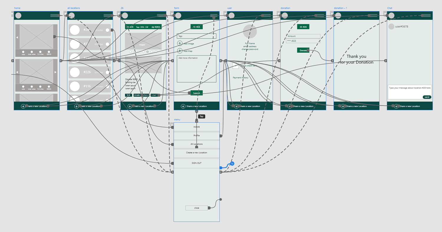
Wireframes
In this stage we created the first level of the design using what we knew about our users and their needs. The headings are clearly listed and separated by categories. There are buttons, icons and images to represent clearly defined sections. All of these provide a simplified and intuitive means of navigation for the user.
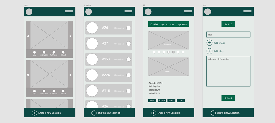
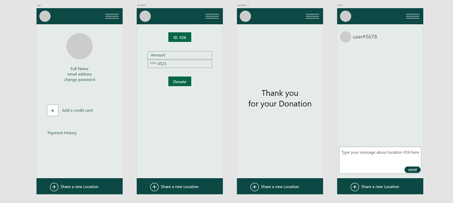

Low-Fidelity Prototype
In this version, the digital wireframes from the previous step were connected together into a working prototype. That meant users were able to interact with each part of the design and test the way it worked. In this example, we demonstrate how the various wireframes that make up the pages of our design fit together when each element becomes interactive.

Research Plan & Usability Study
Our goal was to figure out what difficulties users encountered when trying to complete tasks in the PetShel app and website, such as sending messages, finding new listed locations and sharing a map address. We conducted a remote, unmoderated usability study between Jun 9 to Jun 12. We tasked 10 participants with updating the app. Each session lasted for 15-40 minutes, including the test and interview questions. Participants were anyone concerned about pets and wanted to give them a new safe place. We included a balanced number of male and female who were aged 22 to 48 years old. We presented participants with some tasks that had them interact with the core task in the app, then had them complete the System Usability Scale(SUS). We recorded the sessions and took notes on their progress and feedback, you can see the results below:
| Observations | Participant A | Participant B | Participant C | Participant D | Participant E |
|---|---|---|---|---|---|
| Thinks using this app is useful | |||||
| Doesn't think using the app is useful | |||||
| Easily could do a search and find new locations | |||||
| Had a hard time to find a listed location | |||||
| Feels frustrated share current location on map | |||||
| Speaks in a positive tone | |||||
| Speak in a frustrated tone | |||||
| Speaks in an annoyed tone | |||||
| Speaks in a confident tone | |||||
| Didn't understand connection between locations and message system | |||||
| Confused about donation prosses | |||||
| wanted to update his post |
Usability study insights
| Users were confused about how to find new locations and use filters, therefore they need more information and tips about the filters. |
| Users couldn’t find message section on each location, so they need more context about each location and its different categories. |
| Users didn’t realize the sharing option for current location, therefore they need more information about sharing their location. |

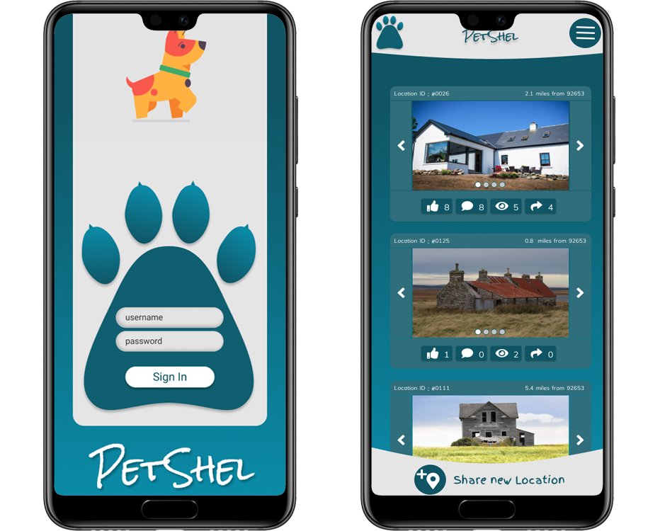
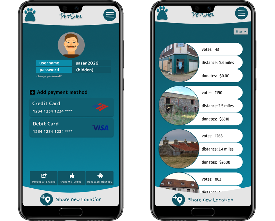
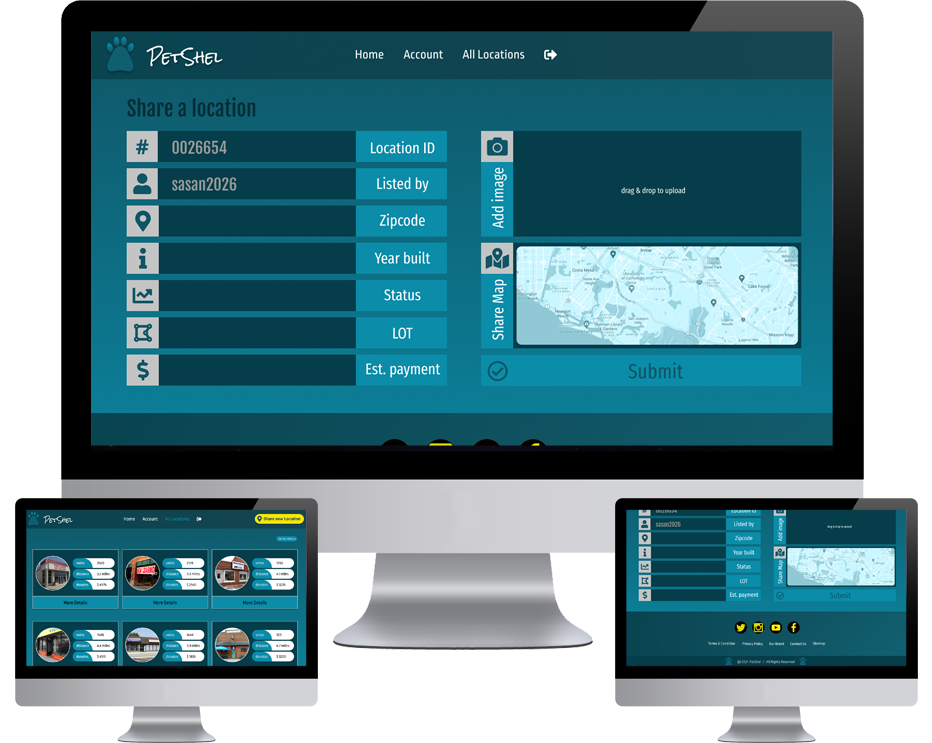
Mockup
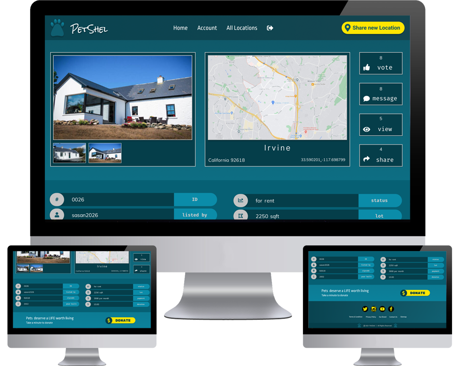

High-Fidelity Prototype