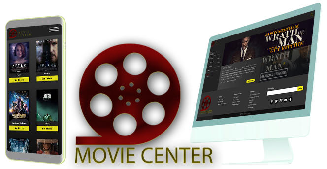
MovieCenter
App & Website
"Movie tickets and Movie time"
"Movie tickets and Movie time"
MovieCenter is a movie theatre based in Sedona, Arizona. It likes to help people to get their ticket as fast as possible. MovieCenter wants to change the ticketing system. They asked us to design a tool to change the way people go to the movies with its online movie ticketing app and website system. For example, this tool will suggest people to watch movies online and get their tickets on their app or email.
Users are all individuals with a passionate interest in movies and all kind of people who love the movies they love.
We created some personas based on our user research. One of our persona is Silvia, a busy married woman who doesn't have enough free time. But she loves movies and doesn't want to waste her time on ticketing. She is looking for an online affordable tool.
Currently, the MovieCenter website is not user friendly and it's NOT responsive.
After the empathic stage we quickly sketched out some ideas from our design using the Crazy 8's approach.
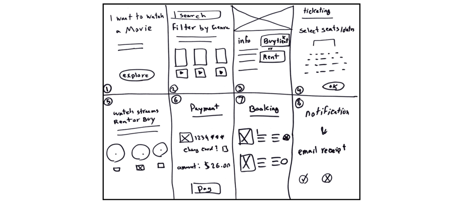
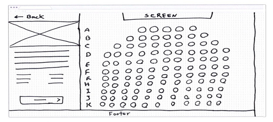
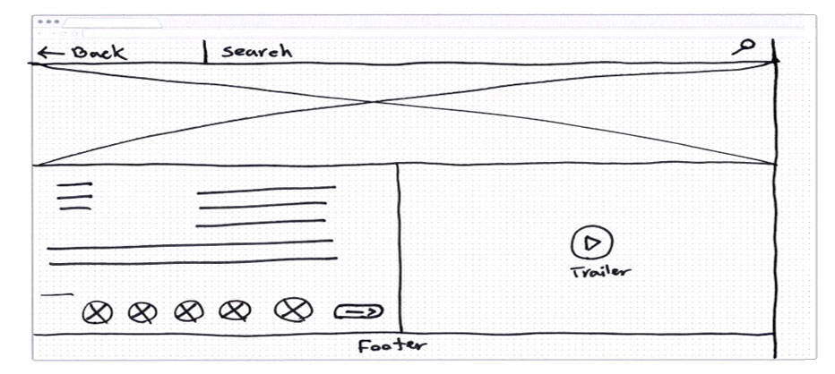
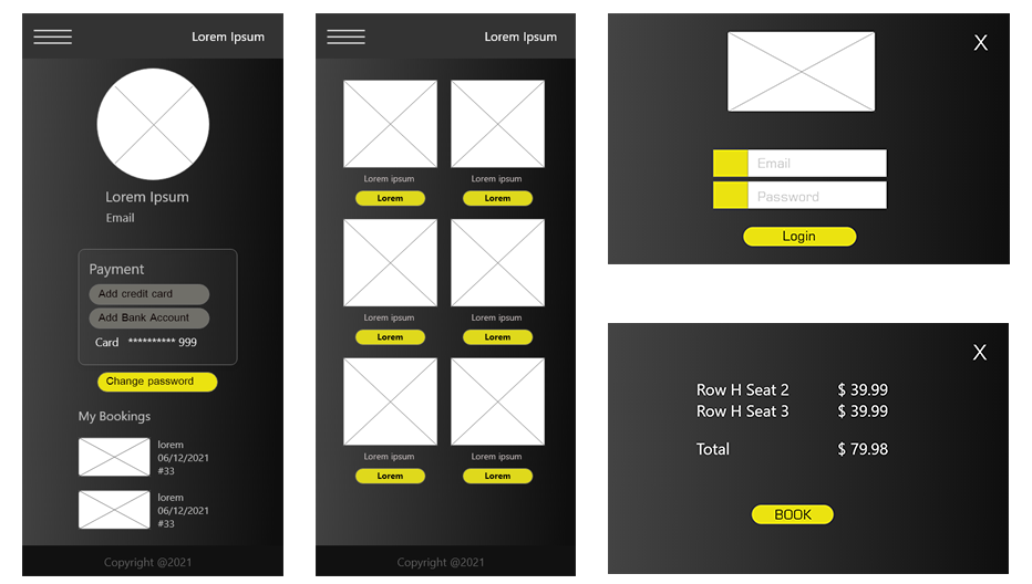
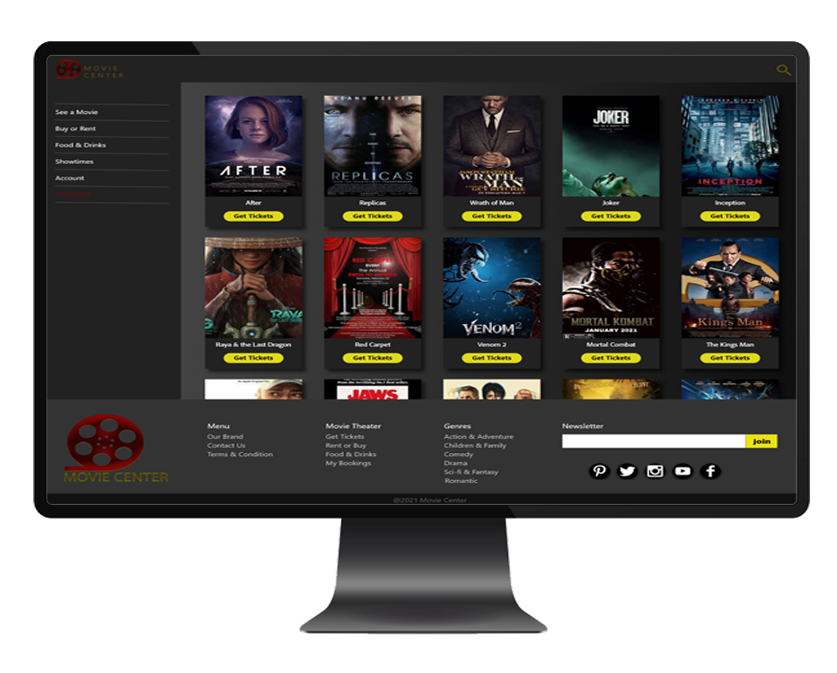
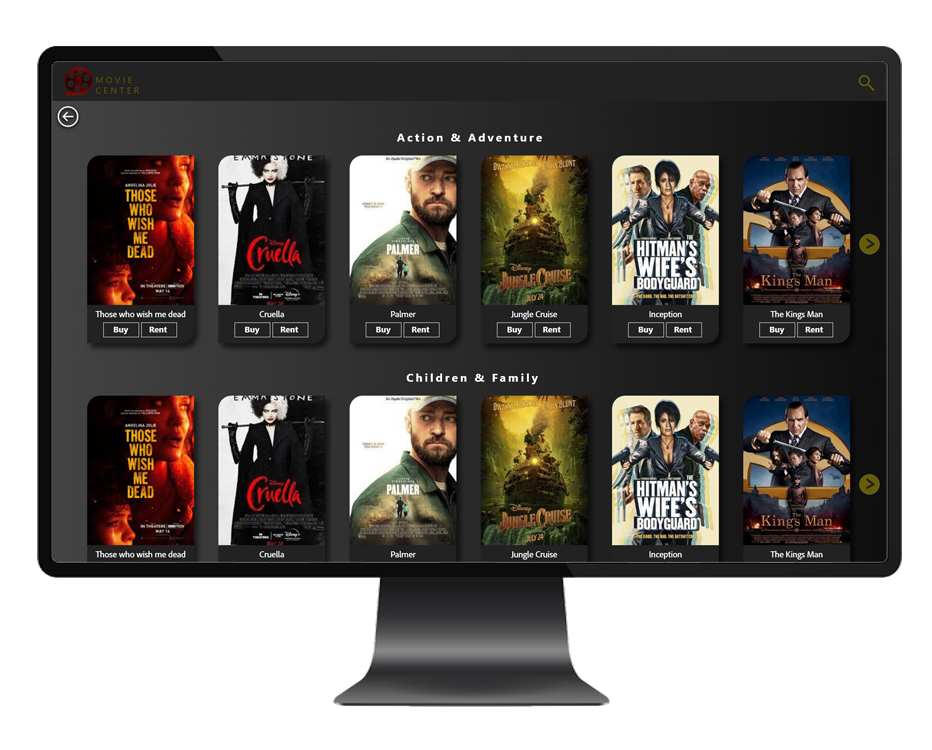
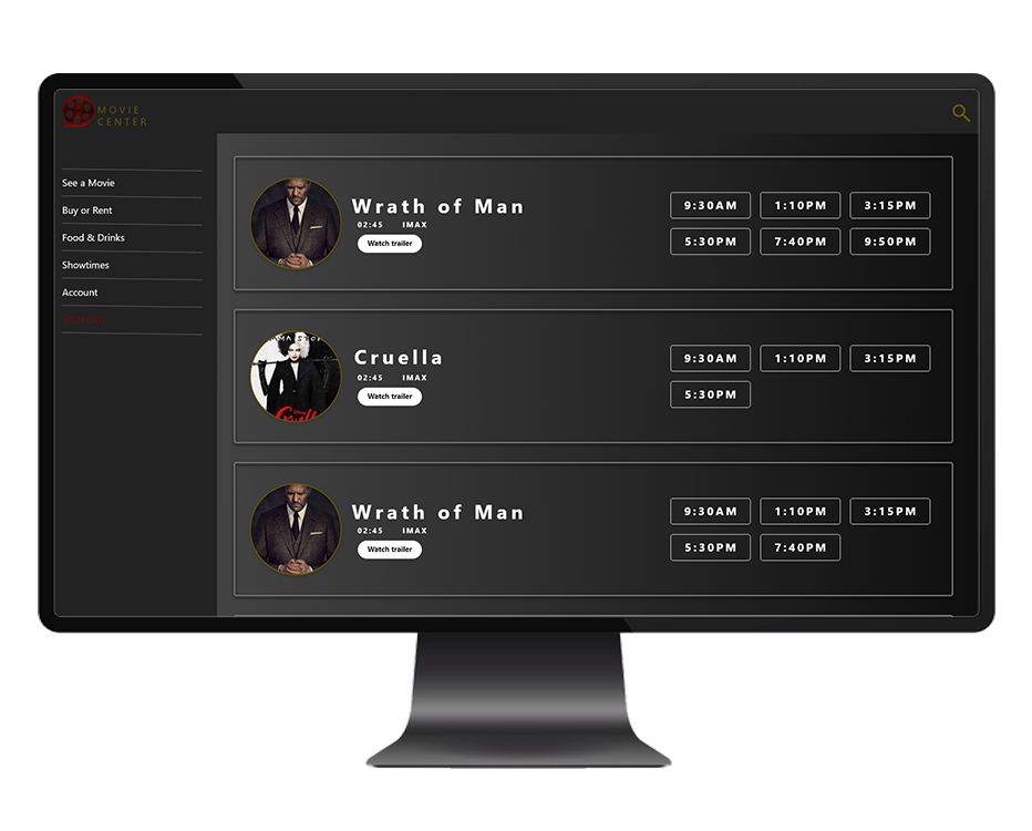
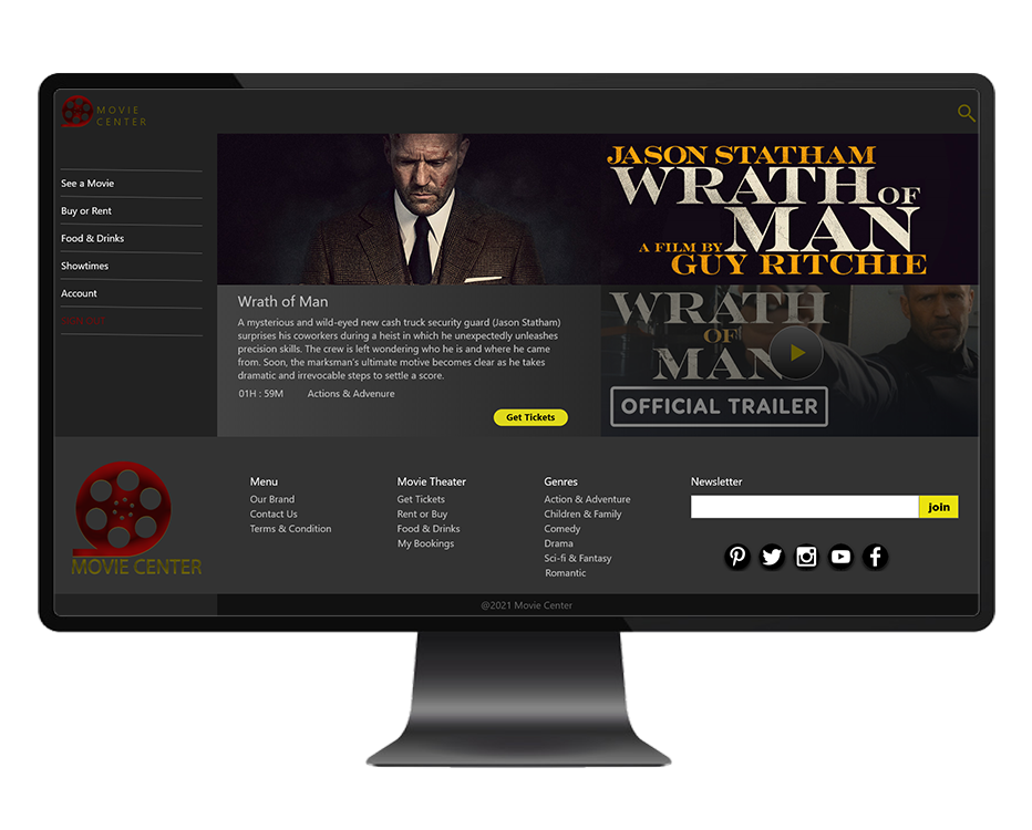
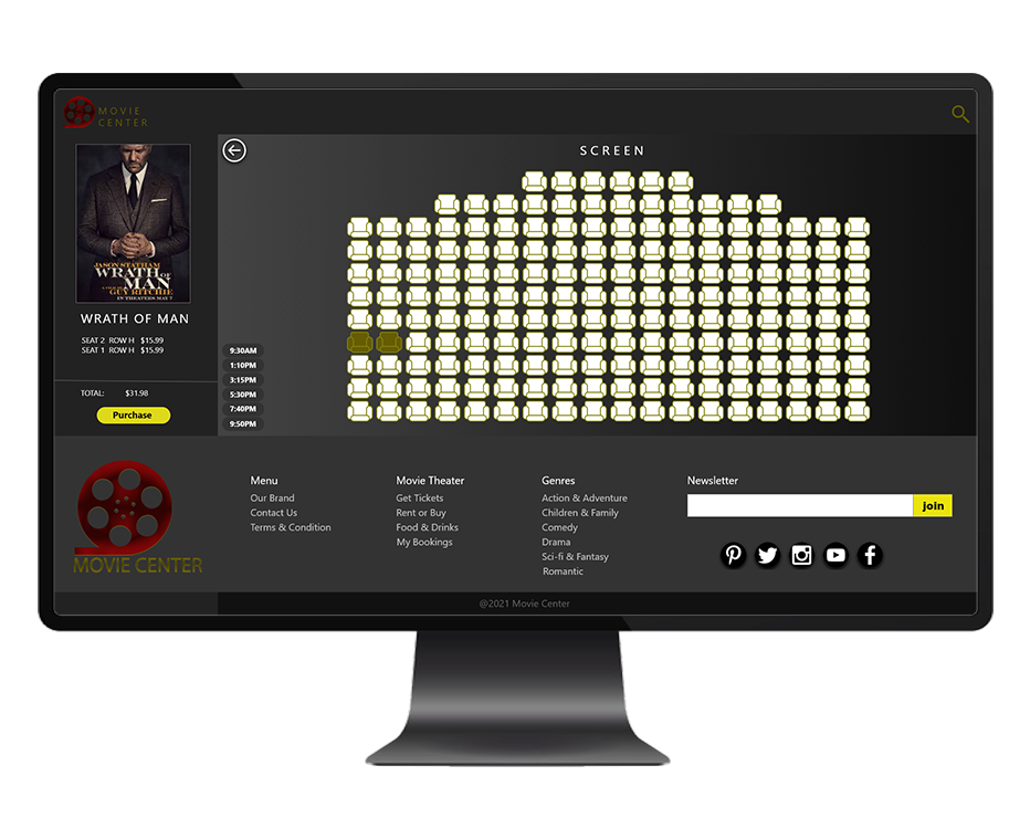
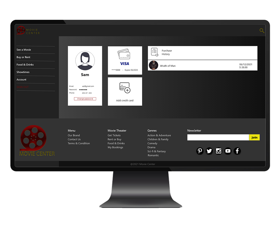
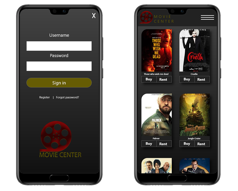
We designed the first level of the design. Then we simplified and turned it into a wireframe. There are images, buttons, icons and different categories to represent our different sections of the app and website.
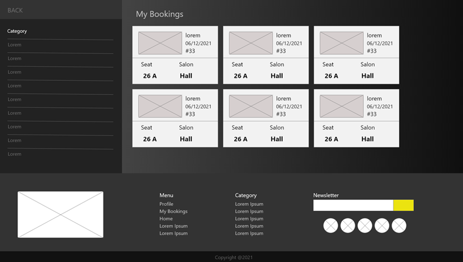
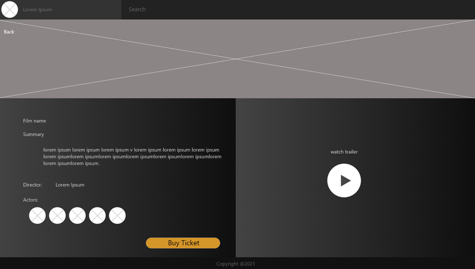
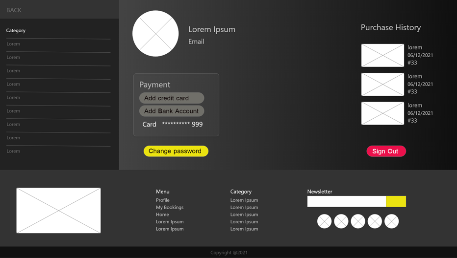
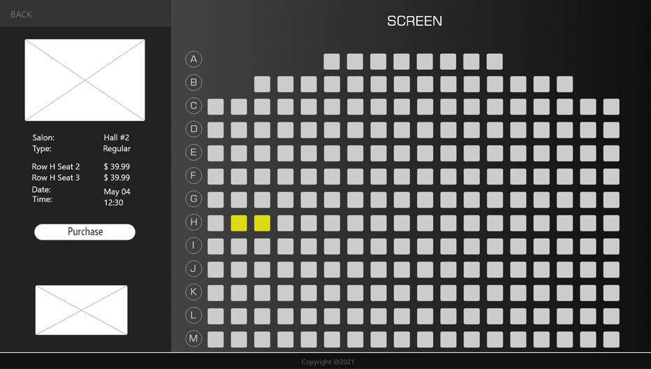
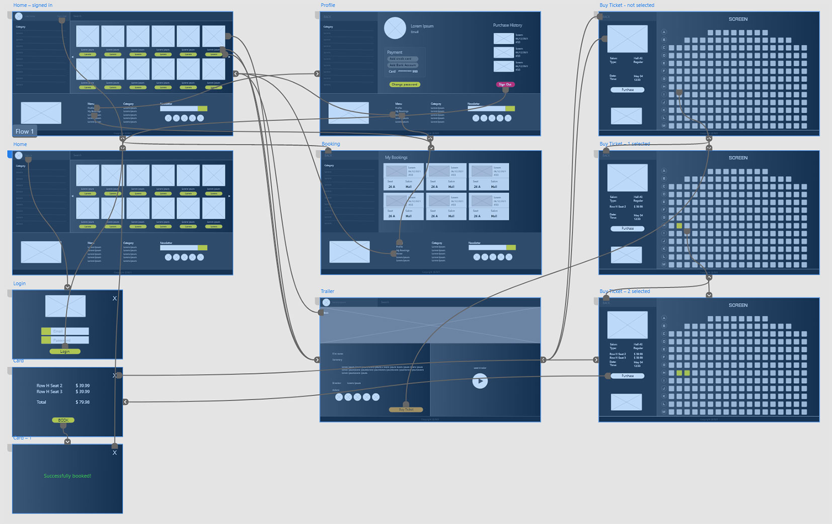
We turned the previous step wireframe into a digital one. Then connected each screen and section together and created a low-fidelity prototype. That meant users were able to interact with each part of the design and test the way it worked.

We conducted a remote, unmoderated usability study between MAY 20-29.
We tasked 22 participants. Each session lasted for 10-20 minutes,
including the test and interview questions.
Our goal was to figure out what difficulties users encountered when trying
to purchase a ticket on the MovieCenter website.
Participants were anyone who loves watching movies. Also, we included a
balanced number of male and female whom
were aged 18 to 52 years old.
We presented participants with some tasks
that had them intact with the core task in the app. We took notes
on their progress, you can see the results below:
| Observations | Participant A | Participant B | Participant C | Participant D | Participant E |
|---|---|---|---|---|---|
| Wants to use this app next time | |||||
| Doesn't want to use this app anymore | |||||
| Easily could do a search and find new movies | |||||
| Had a hard time to use filters and find movies | |||||
| Feels frustrated working with filters | |||||
| Speaks in a positive tone | |||||
| Speaks in a frustrated tone | |||||
| Speaks in an annoyed tone | |||||
| Speaks in a confident tone | |||||
| Didn't understand how to add new payment method | |||||
| Confused about booked tickets | |||||
| Wanted to cancel purchases |
Based on the data from the study, we identified three areas that needed to be addressed:
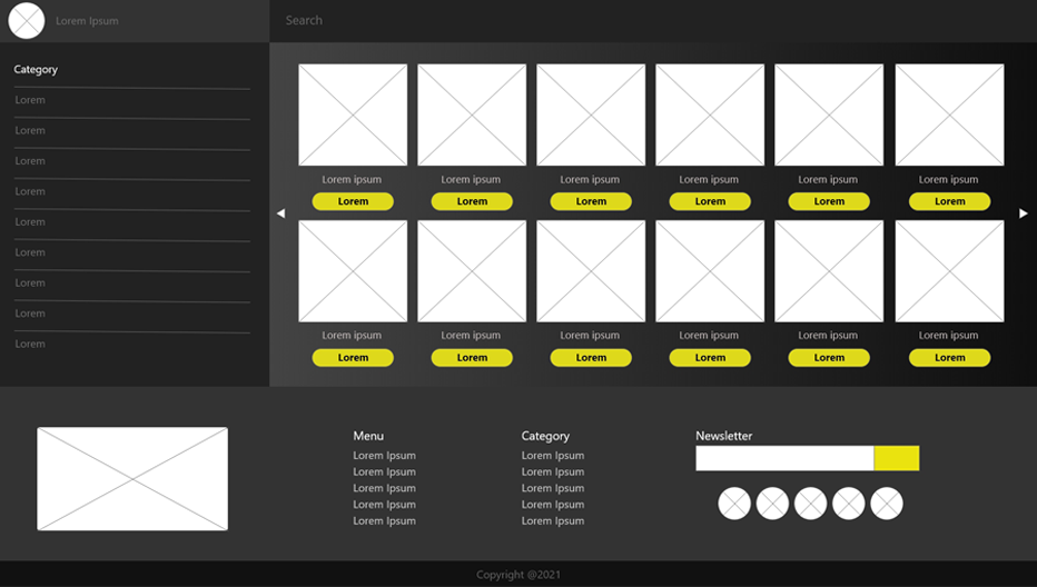
We added colors, icons and images to our design and turned it into a hi-fi version. Also, we improved the user experience based on what we learned during the usability testing session.
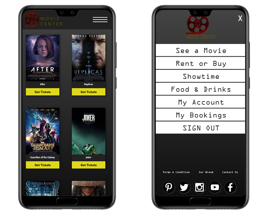
We moved the designing to prototyping to create our hi-fi prototype. We connected all of our screens together into a working version that was representative of our final product. This is what we presented to the development team for production.