1K, an online gaming platform, aims to help users have more fun through video games. Their research team found that users have significant free time, much of which is spent on social networking. They tasked us with designing a mobile challenging game that combines social networking and gaming elements.
1K's main users include all individuals who love to spend their free time on gaming and/or social networking. One of our personas, Sean, is a single 35-year-old full-time employee who has free time after work and often spends it on social and gaming platforms. He loves having a combination of these two categories together.
We turned all feedback from our user research into user personas. Our research showed that users want a platform that combines social networking with gaming, providing both entertainment and social connection in one place.
Currently, almost all of 1K games do NOT have any kind of social network connection, and users often have a fake identity in the gaming environment. This creates a disconnect between users' social and gaming experiences.
We brainstormed different prolific solutions based on feedback from our research to identify different ways we could start designing for users' needs.
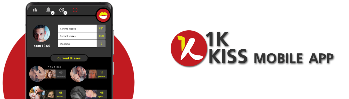
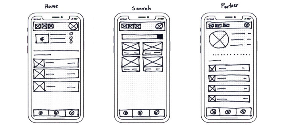
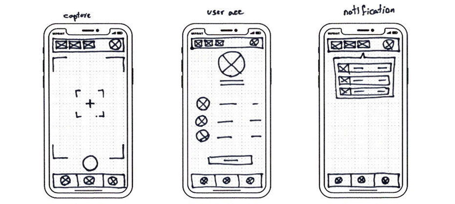
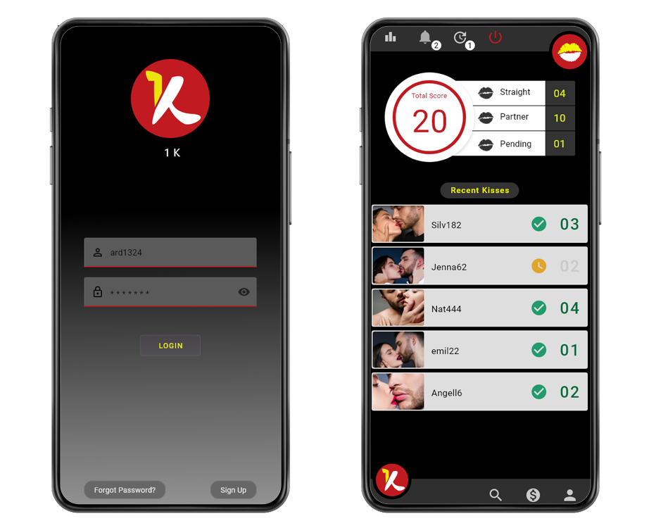
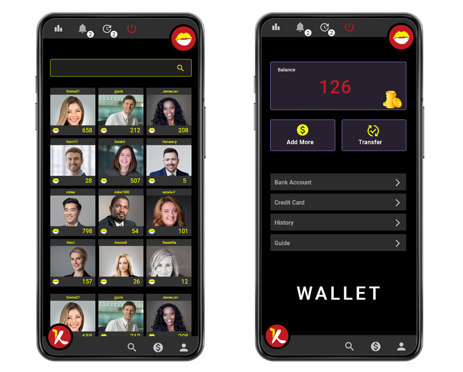
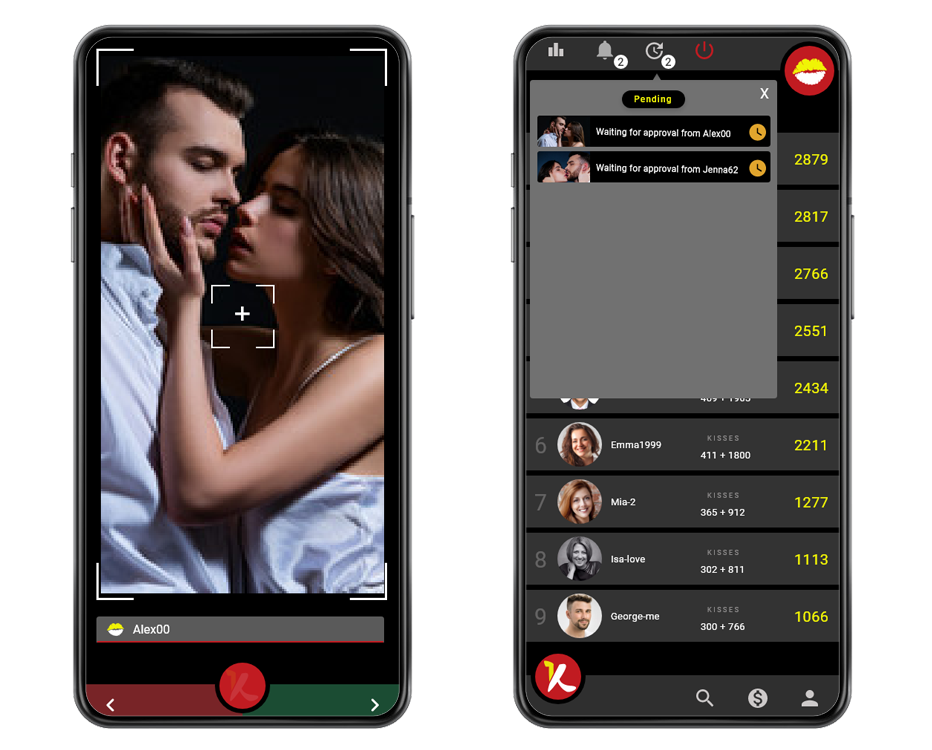
We created the first level of the design based on our users and their feedback. All buttons, icons, and images provide a simplified and intuitive means of navigation for the user.

We conducted a remote, unmoderated usability study to identify difficulties users encountered when trying to use the app. Our study ran from July 2 to July 9, with 14 participants who love online gaming and social platforms. Each session lasted 5-15 minutes, including test tasks and interview questions.
We included a balanced number of male and female participants aged 18 to 35 years old. After interacting with the app, participants completed the System Usability Scale (SUS). We recorded sessions and took notes on their progress and feedback.
| Observations | Participant A | Participant B | Participant C | Participant D | Participant E |
|---|---|---|---|---|---|
| Will play this game again | |||||
| Won't play this game anymore | |||||
| Easily could take a selfie | |||||
| Had a hard time to find the selfie capture button | |||||
| Feels frustrated to take a new selfie | |||||
| Speaks in a positive tone | |||||
| Speak in a frustrated tone |

Based on the data from the study, we identified three areas that needed to be addressed:
Users were confused about how to capture a new selfie, therefore they need more tips about the selfie button.
Users couldn't understand how the app calculates their points, so they need more context about scoring for each selfie.
Users didn't realize how to connect their bank account to the app, therefore they need more information about it.
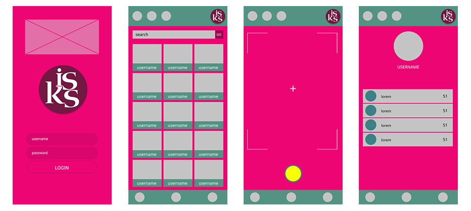
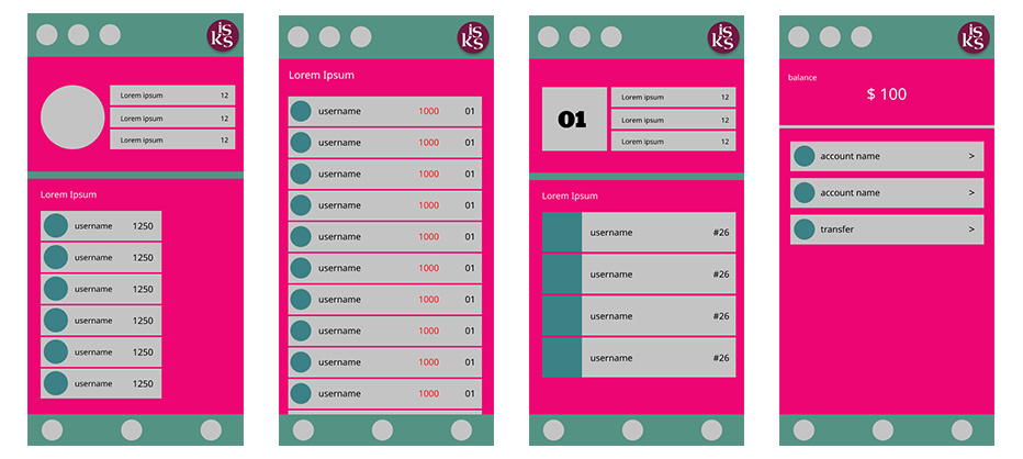
At this stage, we began to add more colors, images, and icons to our designs. We updated the design and changed the shape, size, and structure of content borders and sections to high-fidelity versions. Based on feedback from usability testing, we updated the app by adding the selfie button to the top navbar to make it easier to use and also changed the colors and added more details to our design.
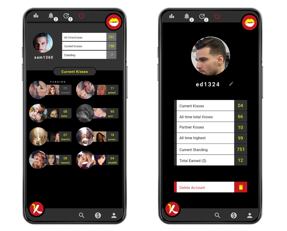

We connected all of our screens together into a working version that was representative of our final product. Each page of the design worked exactly like the real app would. This is what we passed off to the development team for production.

To ensure that our app was accessible, we included screen readers throughout all stages of the design cycle. We tried to provide an inclusive and accessible experience for all users, regardless of their abilities or constraints.